A travel advisor website that loses clients typically has 1 of these 5 classic patterns. Here’s what they look like and how to fix them.
After reviewing tons of advisor websites, I noticed 5 patterns that show up again and again. I’m gonna go through what they are, and what actually fixes each one (without a complete website rebuild.)
A travel advisor website that loses clients doesn’t usually look broken (that’s a little scary, right?!) It probably looks reasonable. The site has photos, a contact form, a list of services. It technically exists. The problem is that ‘technically exists’ and ‘actually converts’ are not the same thing, and most advisors with a travel agent website not getting leads have 1 of these 5 specific, predictable problems sitting in plain sight. (Well, to a web designer or marketing team at least)
What makes these patterns so persistent is that none of them feel like mistakes when you’re in them. They feel like reasonable decisions made with good intentions. That’s what makes them worth naming here for ya, so you can double check your site and make some important changes.
01. The Deal Finder
THE BREAKDOWN
This site is cluttered with supplier offers, promotional banners, and destination deals. The homepage looks like a travel booking engine. There’s no clear advisor identity, just offers and availability. Advisors think clients want deals. Some do. But guess what? The clients worth having, the ones planning high value trips, the ones who will refer, the ones who come back, aren’t choosing an advisor based on a banner. They’re choosing based on trust and expertise. A site that leads with deals signals that deals are what you’re selling. That positions you to compete with Expedia, which is a competition you cannot win. This is a real travel advisor website conversion problem, when the site sells price, price sensitive clients are all you attract. Probably not really who you set out to work with.
WHAT FIXES IT
Lead with your identity and expertise. Deals and offers can exist on the site, just not in the hero, and always secondary. The first thing someone sees should be who you are and who you serve, not what’s on sale.
02. The Brand Billboard
THE BREAKDOWN
This site is covered in travel advisor website supplier logos. Sandals, Disney, Apple Vacations, Virtuoso, celebrity brands, etc. The logos take up more visual real estate than the advisor themselves. It looks like an ad for the suppliers rather than a professional’s website. Supplier affiliations are credibility signals, and great to use, but only when they’re supporting the advisor’s identity, not replacing it. When the logos are bigger than the person, the message becomes “I sell these brands” rather than “I’m an expert who happens to work with these partners.” Those are very different things.
WHAT FIXES IT
The advisor should be the primary presence on every page. Affiliations and certifications belong in a supporting role. Visible, but clearly in service of the person’s credibility rather than dominating the visual hierarchy. This fix is easy, haha, essentially, make them smaller.
03. The Generic Template
THE BREAKDOWN
This travel advisor brochure website was built on a generic platform with no customization beyond the name and a few photos. The layout is identical to hundreds of other small business sites. Nothing about it signals that this advisor understands the travel industry specifically. I get it, building a website is intimidating, especially for the first time, and a generic template gets something live quickly. The problem is that a site that could belong to any business doesn’t build the specific trust a travel advisor needs to earn. Travel advisor website conversion requires specificity, the site has to feel like it was made for this industry, by someone in it.
WHAT FIXES IT
A website designed specifically for a travel advisory business. With the right pages, the right structure, and the right copy prompts. That signals immediately that this person operates in a specific industry with specific expertise. The specificity is the credibility. If you can’t get a new site right now, go through your current one and make some small changes to the layout and design, with the end goal of making it look like a travel website, not a generic business website.
04. The Ghost Site
THE BREAKDOWN
This site exists and might even actually look professional, but it’s a travel agent website outdated in every visible way. The travel agent blog not updated since 2021. The “what’s new” section has an offer from 2 years ago. The copyright footer says 2023. Building a site takes a burst of energy that’s hard to sustain. Once it’s live, the urgency disappears and other things take priority. The site just sits there, slowly becoming a liability rather than an asset, and a clear signal to any visitor that this business isn’t actively maintained.
WHAT FIXES IT
Building the site on a platform that’s easy to update is the foundation. If updating your site requires calling a developer or deciphering code, it won’t happen. If it requires opening a visual editor and clicking on the thing you want to change, it happens. A simple site that stays current with minimal effort is worth more than a complex site that goes stale. Again, like #3 though, if you can’t move your site to a platform that is easier for you to update right now, then for now, just give your site a little more attention. Update that footer copyright year, add some newer information, blog a little, etc. Make what you have work for you rather than against you.
05. The Identity Crisis Site
THE BREAKDOWN
This travel agent website has too many ‘niches’. The services page lists eight different travel types. The tagline is something like “your full service travel experts.” Every page targets a slightly different audience. Nothing is specific enough to make anyone feel like this site was built for them. Advisors are afraid of turning business away, so the site tries to capture every possible client type and captures none of them. No one lands on a site and thinks “this is exactly what I was looking for” when the site is clearly trying to be everything to everyone. It’s the most common travel advisor website conversion killer in the space.
WHAT FIXES IT
A clear niche and the confidence to say it. One specific sentence about who you serve and what you specialize in. The right clients recognize themselves immediately. The wrong ones leave. Both of those outcomes are exactly what you want.
The common thread
Every one of these ‘oopsies’ has the same root cause: the site was built around what the advisor wanted to say, rather than what the potential client needs to understand.
What should a travel advisor homepage answer in the first 6 seconds?
3 things: Is this for me? Do they know what I need? And what do I do next? A travel agency website that converts answers all 3 clearly and quickly. A site that makes the visitor work to figure any of that out loses people. And the worst part, it’s always a silent tab close, and you never know why they left.
You might recognize yourself in at least one of these. Oops. But the good news is that none of them really require a complete rebuild to fix. You mostly need a clearer point of view about who you serve and the confidence to lead with it, which is totally do-able.
If you are at the stage of needing a new site for your travel business, then great news
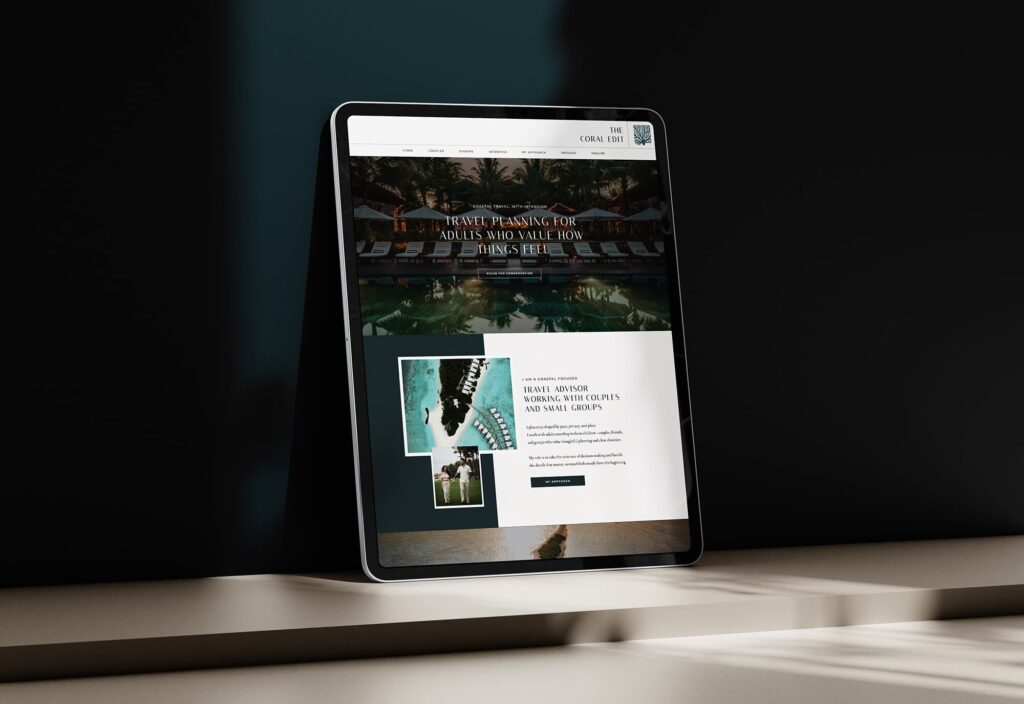
JetSite websites are built to avoid every one of these failure patterns. All of them structured for travel advisors, designed to answer the right questions, and easy enough to keep current. A travel agency website that converts starts with the right foundation.
Browse JetSite websites here, and get past all these travel business roadblocks. jetsiteandroam.com/travel-agent-website-templates